#designsystem

#web

#front-end

#Sketch

#Figma

Building a multi-brand design system component library at team.blue

Building a multi-brand design system component library at team.blue

Building a multi-brand design system component library at team.blue

Building a multi-brand design system component library at team.blue

Building a multi-brand design system component library at team.blue

Building a multi-brand design system component library at team.blue

At team.blue my focus was on building and maintaining a multi-brand component library, doing UX design for complex projects such as the redesign of a control panel, building a few components using HTML/Twig, and onboarding new brands to the design system by writing clear documentation and helping individuals or teams with any questions.

At team.blue my focus was on building and maintaining a multi-brand component library, doing UX design for complex projects such as the redesign of a control panel, building a few components using HTML/Twig, and onboarding new brands to the design system by writing clear documentation and helping individuals or teams with any questions.

At team.blue my focus was on building and maintaining a multi-brand component library, doing UX design for complex projects such as the redesign of a control panel, building a few components using HTML/Twig, and onboarding new brands to the design system by writing clear documentation and helping individuals or teams with any questions.

At team.blue my focus was on building and maintaining a multi-brand component library, doing UX design for complex projects such as the redesign of a control panel, building a few components using HTML/Twig, and onboarding new brands to the design system by writing clear documentation and helping individuals or teams with any questions.

At team.blue my focus was on building and maintaining a multi-brand component library, doing UX design for complex projects such as the redesign of a control panel, building a few components using HTML/Twig, and onboarding new brands to the design system by writing clear documentation and helping individuals or teams with any questions.

At team.blue my focus was on building and maintaining a multi-brand component library, doing UX design for complex projects such as the redesign of a control panel, building a few components using HTML/Twig, and onboarding new brands to the design system by writing clear documentation and helping individuals or teams with any questions.

2019 - 2022

Timeline

UI/UX (Product) Designer

Role

2019 - 2022

Timeline

UI/UX (Product) Designer

Role

Background

Background

After TransIP Group and Combell came together as team.blue, creating a design system that supported multiple brands became super important for delivering top-notch user experiences across all the brands. It was a massive challenge, though, with so many stakeholders in the mix. We're talking different product teams from each brand, plus folks from marketing and recruitment that used the CMS to build the landing pages using the design system components.

Our team of talented designers created the visual styles for brands that were due for redesigns, and then it was my turn to dive into Sketch (and later Figma) to build out all the components in a white-label format from scratch. These became the backbone of our white-label landing pages and control panels. Each component was crafted with its specific use case in mind and made simple to tweak and customise and styling was applied through themed libraries. Our goal was always to 'make advanced simple' and empower every designer, developer, and marketer to create excellent, user-friendly experiences without breaking a sweat.

Goals

Goals

1

Make advanced simple.

While the company had mostly tech-savvy employees, there were also teams that had to use the design system (for example through a CMS) and understand what they were building and how to easily do that.

1

Make advanced simple.

While the company had mostly tech-savvy employees, there were also teams that had to use the design system (for example through a CMS) and understand what they were building and how to easily do that.

1

Make advanced simple.

While the company had mostly tech-savvy employees, there were also teams that had to use the design system (for example through a CMS) and understand what they were building and how to easily do that.

2

Facilitate the switch from Sketch to Figma

Helping now only designers, but also developers get used to working with Figma. Thinking of workflows and features that would simplify and empower the team to built a strong component library.

2

Facilitate the switch from Sketch to Figma

Helping now only designers, but also developers get used to working with Figma. Thinking of workflows and features that would simplify and empower the team to built a strong component library.

2

Facilitate the switch from Sketch to Figma

Helping now only designers, but also developers get used to working with Figma. Thinking of workflows and features that would simplify and empower the team to built a strong component library.

Figma library analytics interface, showing the top teams that used components from the design system and which components were most inserted into design files.

A simple accordion component designed and built from scratch to apply to multiple brands

A simple accordion component designed and built from scratch to apply to multiple brands

Work & learnings

Work & learnings

1

Thinking hollistically and diving into context

As a young designer, I was intrigued by the emergence of design systems at major corporations and initially sought to replicate their approaches. However, I soon discovered that the success of our system relied heavily on active involvement from its users. Balancing the development of components with comprehensive feature considerations was a significant learning experience. It became clear that copying what companies like Spotify or IBM wasn't good enough or in some cases not good at all. I needed to tailor our approach to fit the unique needs of team.blue.

2

Mentoring & gathering feedback

Mentoring other designers and developers on learning Figma was something I loved to do. Hopping into a Figma file with other designers to check on a bug or help out with auto-layout was so useful because I could get feedback on the component library in Figma and simultaneously help out a designer with their issue. It's a win-win!

I've had the pleasure of getting to know Joshua when I worked at team.blue with him. We started out as colleagues but ended up being close friends. Not only is he a great person, he is truly good at what he does. The user is always on Joshua's mind, his personality radiates energy and enthusiasm for things he cares about. I've had the opportunity to learn to see design through his eyes and I could recommend that to anybody. From time to time I'll ask myself: "What would Josh think of this?" and that's second best to asking him.

Johann Behrens

iOS Developer

Conclusion

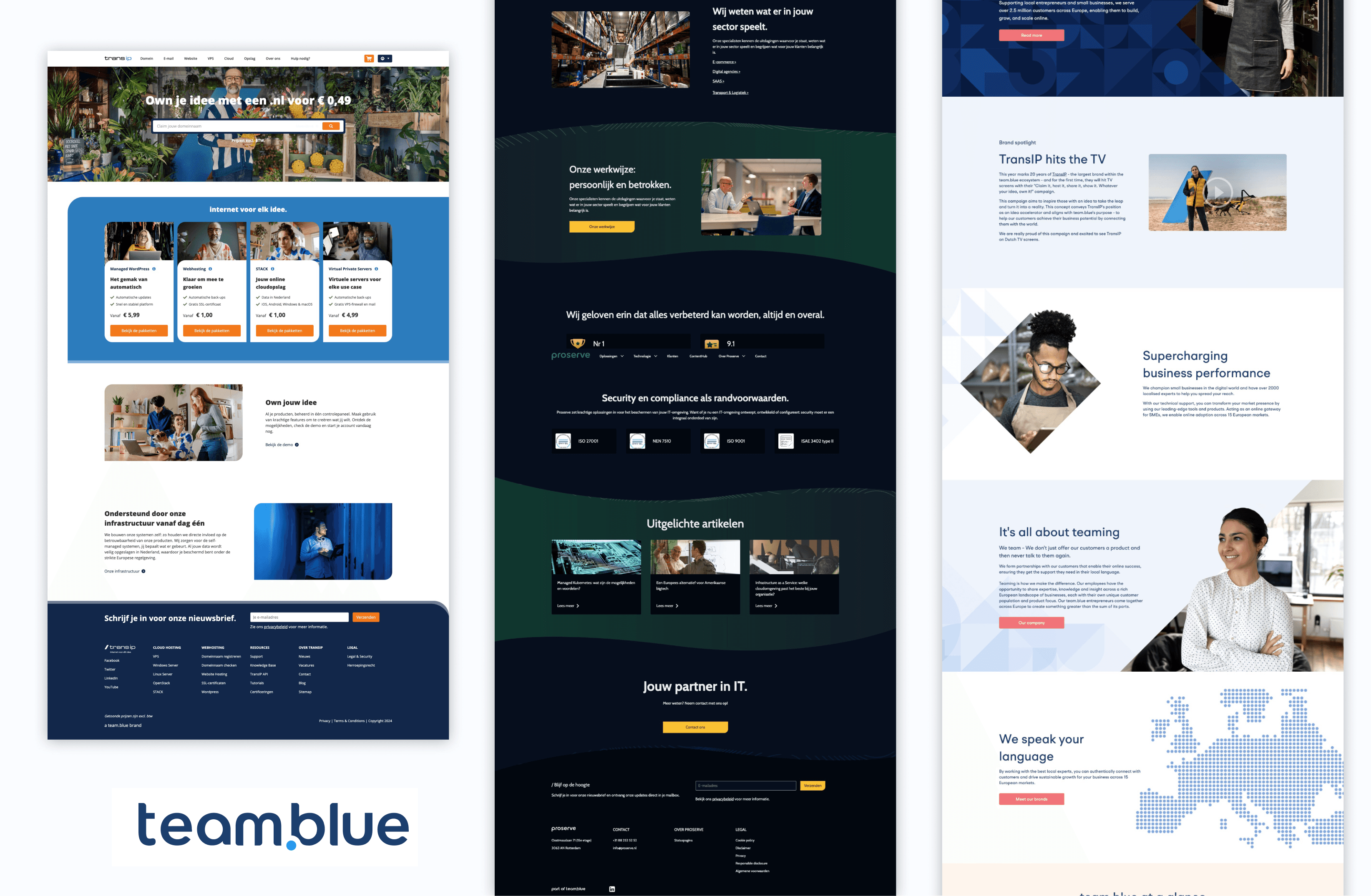
With TransIP Group and Combell coming together, the need for a solid design system became crystal clear across all team.blue brands.

From speaking to different teams to diving into the transition from Sketch to Figma, we made it happen.

Our goal was simple: make advanced simple. And even though most of us were tech-savvy, I always tried to make sure everyone could jump in and use the system, whether they were designing, developing, or building landing pages using the CMS.

I learned a ton along the way. Turns out, copying big companies' methods wasn't the answer. We had to tailor our approach to fit team.blue's business goals and needs of the users. Plus, mentoring other designers and devs in Figma was a blast. Getting feedback while helping out—it was a win-win.

Looking back, building this multi-brand design system component library has been a heck of a journey. It's not just a project—it's a testament to teamwork, adaptability, and always learning on the go. And I couldn't be prouder of what we've achieved together.

My time at team.blue has been a great learning experience. Being able to work on crafting a multi-brand design system while tackling some complex UX challenges was one of the most valuable starts I could've had on design systems.

Built in Framer · ©2024

Built in Framer · ©2024

Built in Framer · ©2024

Built in Framer · ©2024